

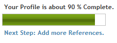
Sometimes you want to display an indicator of completeness of something such as indicator of profile completeness, task or operation completeness. In ASP.Net there is no such control so we will create an ASP.Net Indicator User Control like the image below
Using the Code:
To create an ASP.Net Indicator control, follow the following steps:
1. Create a new ASP.NET Web Application using Visual Studio 2008/2010.
2. Rename WebForm1.aspx to Default.aspx.
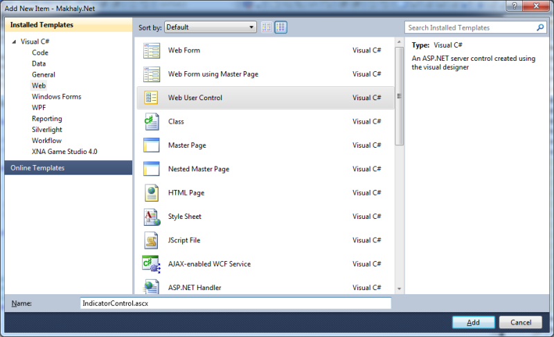
3. Right click the project in Solution Explorer and select Add New Item. The Add New Item Dialog will appear.
4. Select Web in the Left Pane and from the right pane select the Template for Web User Control.
5. Name it IndicatorControl.ascx as in the following image
6. Visual Studio will add three files
a. IndicatorControl.ascx for the control interface
b. IndicatorControl.ascx.cs the code behind file
c. IndicatorControl.ascx.designer.cs the designer code behind file.
7. Open the IndicatorControl.ascx file and type the following ASP.NET Code to create the User Control Interface
<asp:Panel ID="IndicatorPanel" runat="server" BorderColor="Silver" BorderStyle="Solid"
BorderWidth="1px"Height="20px"HorizontalAlign="Left"Width="200px">
<asp:Label ID="IndicatorLabel"runat="server"Height="20px"BackColor="Green">
</asp:Label>
</asp:Panel>
a. The above code simply creates an ASP.NET panel and names it IndicatorPanel, this panel will act as the Border of the Indicator and gives its border a Silver Color, sets the Border Style to Solid color and Border Width to 1 pixel
b. Sets its Height and Width Properties to 20 pixels and 200 pixels respectively.
c. Add an ASP.NET Label and name it IndicatorLabel, this label will present the completed percent of the profile and set its height to 20 pixels and its background color to green.
8. Then open the IndicatorControl.ascx.cs file and type the following code to create the behavior of the Indicator Control
public partial class IndicatorControl: System.Web.UI.UserControl
{
private bool warning;
private double percent;
protected void Page_Load(object sender, EventArgs e)
{
try
{
IndicatorLabel.Width = new Unit(percent * IndicatorPanel.Width.Value, UnitType.Pixel);
IndicatorLabel.ToolTip = percent.ToString("p0");
}
catch (Exception)
{
}
}
[Browsable(true)]
[DefaultValue(false)]
[Bindable(BindableSupport.Yes,BindingDirection.OneWay)]
public bool Warning
{
get
{
return warning;
}
set
{
warning = value;
}
}
[Browsable(true)]
[Bindable(BindableSupport.Yes,BindingDirection.OneWay)]
public double Percent
{
get
{
return percent;
}
set
{
percent = value;
if (percent < 0)
percent = 0;
if (percent > 1)
percent = 1;
IndicatorLabel.Width = new Unit(percent * IndicatorPanel.Width.Value, UnitType.Pixel);
IndicatorLabel.ToolTip = percent.ToString("p0");
if (warning)
{
if (percent > 0 && percent < .50)
{
IndicatorLabel.BackColor = Color.Green;
}
else if(percent >= .50 && percent < .75)
{
IndicatorLabel.BackColor = Color.Gold;
}
else if(percent >= .75 && percent < .90)
{
IndicatorLabel.BackColor = Color.Orange;
}
else if(percent >= .90)
{
IndicatorLabel.BackColor = Color.Red;
}
}
}
}
[Browsable(true)]
[DefaultValue(20)]
[Bindable(BindableSupport.Yes,BindingDirection.OneWay)]
public double Width
{
get
{
return IndicatorPanel.Width.Value;
}
set
{
IndicatorPanel.Width = new Unit(value, UnitType.Pixel);
}
}
[Browsable(true)]
[DefaultValue(20)]
[Bindable(BindableSupport.Yes,BindingDirection.OneWay)]
public double Height
{
get
{
return IndicatorPanel.Height.Value;
}
set
{
IndicatorPanel.Height = new Unit(value, UnitType.Pixel);
IndicatorLabel.Height = new Unit(value, UnitType.Pixel);
}
}
protected override void OnInit(EventArgs e)
{
base.OnInit(e);
Page.RegisterRequiresControlState(this);
}
protected override object SaveControlState()
{
return percent;
}
protected override void LoadControlState(object savedState)
{
percent = Convert.ToDouble(savedState);
}
}
a. In the above code we simply create two variables one for making the indicator control for warning operations and one for saving the percent completed.
b. In the Page Load Event of the control we set the IndicatorLabel width to the percent value and set its ToolTip property to this percent followed by the % character.
c. We need to use this indicator controls in warning and completeness indications so we have added the Warning Property. If this property is true the back color of the IndicatorLabel will be different according the percentage value of warning.
d. We mark the Warning property with the Browsable attribute to make the Visual Studio able to display this property in the Properties window and Bindable attribute to make it used in data binding.
e. We add a new property the Percent property to make the User Control usable. This property sets or gets the value of percent variable declared in the start of the IndicatorControl class.
f. In the set operator we set the percent variable with the value, set it to zero if the assigned value is less than zero and set it to 100 if it is greater than 100.
g. Set the width of the IndicatorLabel to the percent of the total IndicatorPanel width and sets the IndicatorLabelToolTip property to the percent followed by % character.
h. We check the warning variable value if its value is true then we displays a new color for each warning level.
i. If the percent is greater than 0 and less that 50% we set the IndicatorLabel back color to Green
j. If the percent is greater than or equal to 50% and less that 75% we set the IndicatorLabel back color to Gold.
k. If the percent is greater than or equal to 75% and less that 90% we set the IndicatorLabel back color to Orange.
l. If the percent is greater than or equal to 90% we set the IndicatorLabel back color to Red.
m. You can change the percent and the colors according to your warning business values.
n. We need to customize the control width and height to meet every one needs so we have added two public properties that can be set from the control.
o. The width property gets or sets the width of the container, the IndicatorPanel control.
p. The Height property gets or sets the height of the container, the IndicatorPanel control.
9. Open the Default.aspx file in design Mode.
10. From the Solution Explorer, Drag the IndicatorControl and drop it on the Default.aspx page. This will register the User Control in the Default.aspx page and create a new instance of the IndicatorControl as in the following code
<%@ RegisterSrc="IndicatorControl.ascx"TagName="IndicatorControl"TagPrefix="uc1"%>
<div>
<p>
Warning="false" Percent="0.60"</p>
<br />
<uc2:IndicatorControl ID="IndicatorControl1"runat="server"Height="22"Width="200"
Warning="false"Percent="0.60"/>
<br />
<p>
Warning="true" Percent="0.40"</p>
<uc2:IndicatorControl ID="IndicatorControl2"runat="server"Height="22"Width="200"
Warning="true"Percent="0.40"/>
<br />
<p>
Warning="true" Percent="0.60"</p>
<uc2:IndicatorControl ID="IndicatorControl3"runat="server"Height="22"Width="200"
Warning="true"Percent="0.60"/>
<br />
<p>
Warning="true" Percent="0.80"</p>
<uc2:IndicatorControl ID="IndicatorControl4"runat="server"Height="22"Width="200"
Warning="true"Percent="0.80"/>
<br />
<p>
Warning="true" Percent="0.95"</p>
<uc2:IndicatorControl ID="IndicatorControl5"runat="server"Height="22"Width="200"
Warning="true"Percent="0.95"/>
<br />
<br />
</div>
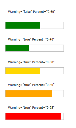
11. The above code creates 5 instances of the Indicator Control and each with its own property values.
12. Compile your project and Browse the Default.aspx page in Internet Explorer you will get the following image
13. If you have any controls on the page that post back like an ASP.NET Button the indicator percent is set to zero. This is the reason why we override the last three methods in the IndicatorControl class (OnInit, SaveControlState, LoadControlState).
14. We override OnInit method to tell ASP.Net that this Control state must be persisted.
15. We override SaveControlState to save the control state and LoadControlState to load the control state as we save it.
16. In the IndicatorControl we need to save the percent variable value.
17. Compile your project and Browse the Default.aspx page in Internet Explorer.
18. If you click on any button the Indicator Control maintains its state information.
Now you have an indicator control that can be used in data binding and indicating the percent completed and used in warning indication.
15 March 2022

17 February 2022
09 December 2019